TRIXI GRONAU Manufactory · Knowledge
Nibs, Ink and Lettering
The tool follows the idea
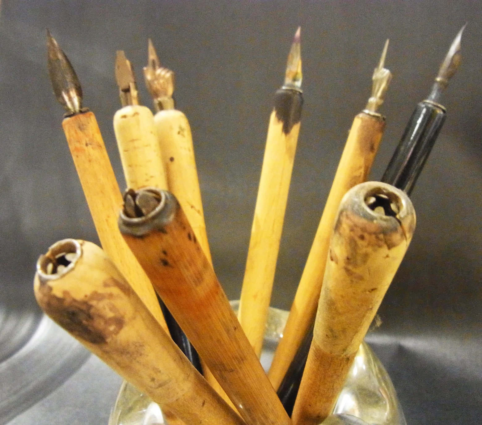
In calligraphy there is no single right nib or single right ink for me.
Which nib we use always depends on the commission, on the paper, on the lettering we want and on the effect it should have.
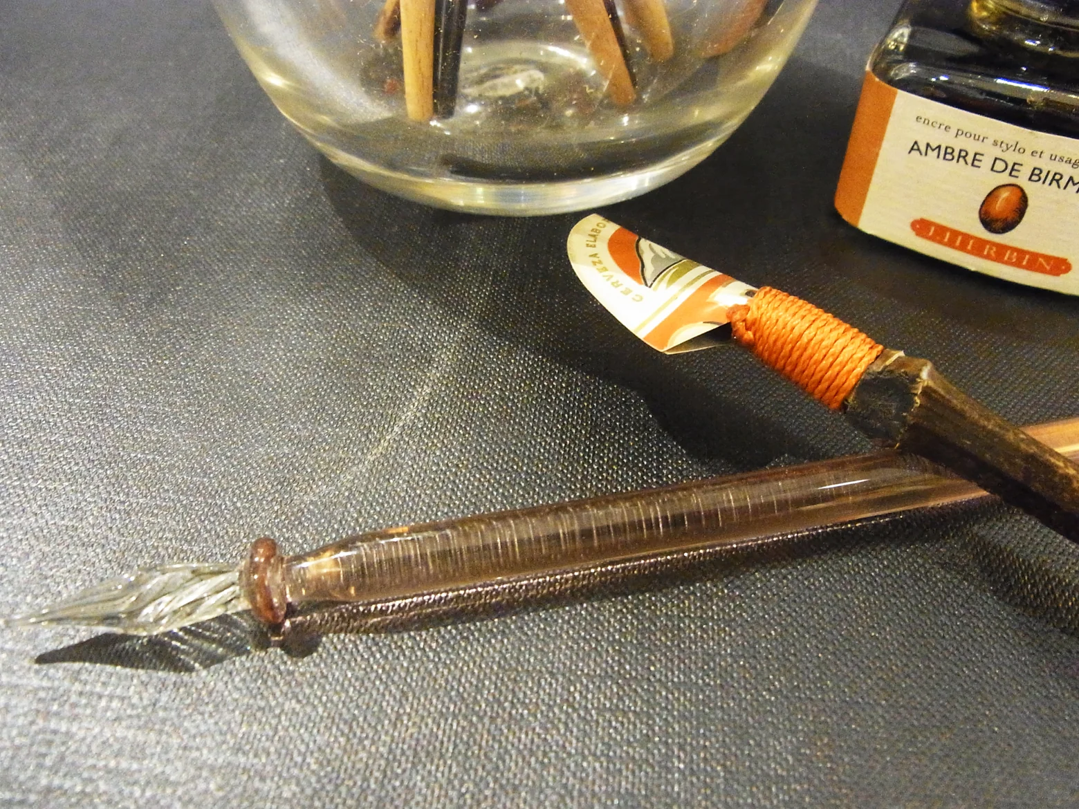
That is why our studio kept a wide choice of nibs and writing tools: different nib sizes, stub nibs, broad edged nibs, quills and glass pens. Brushes and calligraphic fibre tip pens came in alongside them.
The right nib is the one that suits the paper and the design, which is rarely the prettiest one in the drawer.
Ink is part of the design
The colour of the ink was never chosen independently of the design either.
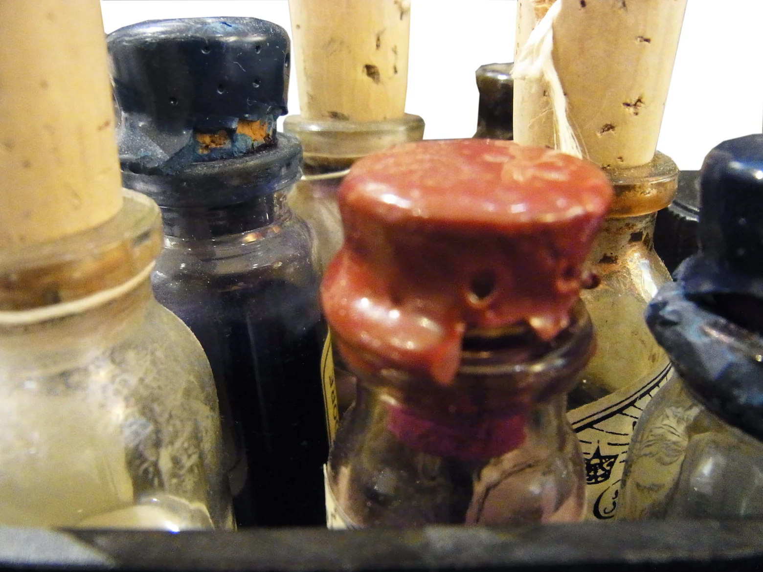
We work with inks by Herbin from France, with Caran d’Ache, with Scriptol and with shades we mix ourselves, among others.
I am especially fond of the Herbin inks. They come in a great many colours and some of them even contain fine shimmering particles.
On customer commissions we took colour requests into account and, where necessary, mixed different inks together until we had the shade we wanted.
A clean nib goes without saying
It sounds obvious, and it matters: a nib has to be clean.
If it has been dipped in black ink and a pale yellow is to be written next, the smallest trace of black is enough to change the colour.
So nibs were cleaned thoroughly between different colours.
With bespoke shades in particular, that care is part of the result.
Not every surface takes ink
Paper and material matter as much as nib and ink.
A classic water soluble ink has to be absorbed by the surface. If it only sits on top, it can bead up or adhere poorly.
Then you have to work differently.
On unusual materials, calligraphic fibre tip pens can be used, for example, because their colour holds better on the surface.
The same principle applies here. We look for the tool that suits the material, rather than expecting the material to suit our tool.
Lettering comes out of the interplay
Nib, ink and paper cannot be looked at separately.
A broad nib creates a different effect from a fine one. A dark ink reads differently from a pale or shimmering shade. And a heavily textured surface calls for a different tool from a smooth paper.
It is exactly this interplay that makes the work interesting.
Sometimes a particular lettering style comes first. Sometimes a paper colour or a table setting. And sometimes everything begins with an unusual material.
In the end the tool, the colour and the design have to fit together.