TRIXI GRONAU Manufactory · Knowledge
What is Calligraphy?
When lettering becomes one of a kind
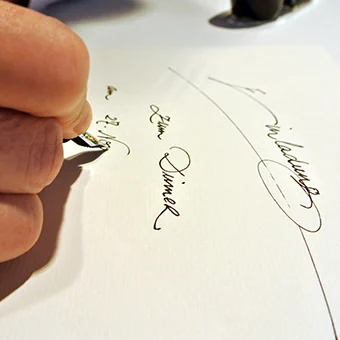
Calligraphy means far more to me than writing beautifully. Handwriting can give a name, a word or a whole text a character of its own.
In our studio, calligraphy was part of our design work for many years. Michael worked with me for twelve years and had a wonderfully creative command of the craft.
And it was never only about nib and ink. Michael worked with a wide range of nibs, but just as readily with brushes, pieces of wood, sponges or even a plain wooden clothes peg.
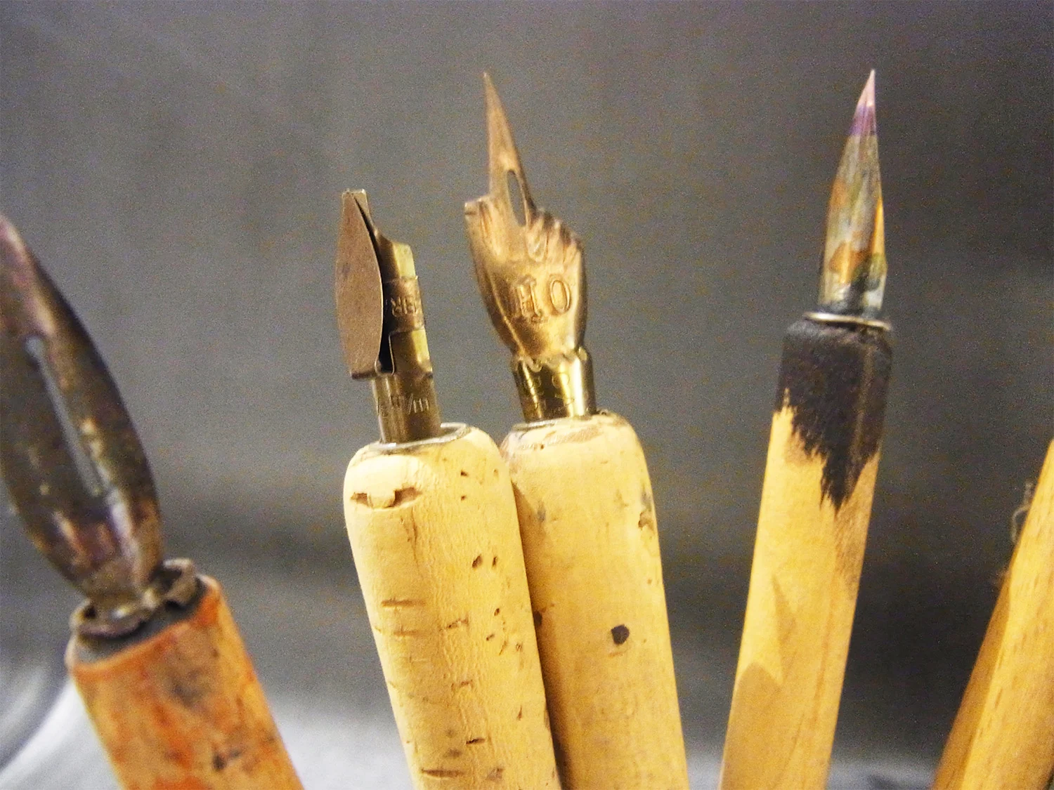
What always decided the choice was the effect we wanted to achieve.
From handwriting to print
What I found most exciting was the link between calligraphy and our own print manufactory.
A handwritten piece did not have to stay a one off with us. We could digitise Michael’s hand and then work it into a printed design.
For a Hamburg family office, for example, a thank you card began entirely by hand. I digitised the lettering afterwards and we printed around 150 copies of it on mould made paper.
The character of the handwriting stayed intact and at the same time we could produce a larger run.
We worked this way on invitations too. Sometimes only the word for invitation was written calligraphically, digitised and then printed along with the rest.
On other jobs the invitation was printed first and the name of each individual guest added by hand later.
That combination of one off piece and printed run always interested me.
The lettering sample comes first
On individual commissions we first settled the paper, the colour and the effect we were after.
Michael made several lettering samples where they were needed. That way the customer could see how differently a name or a word can read through the lettering alone.
Only once the direction was clear was the final piece written, or the calligraphic artwork digitised for print.
So calligraphy was more to us than a last decorative step. It could already be part of the design.
Not every paper calls for the same nib
Paper and tool have to suit each other.
A smooth surface behaves differently from a heavily textured paper. Whenever a classic nib was unsuitable for a material, Michael looked for another way.
Then a brush, a piece of wood, a sponge or a clothes peg came into play.
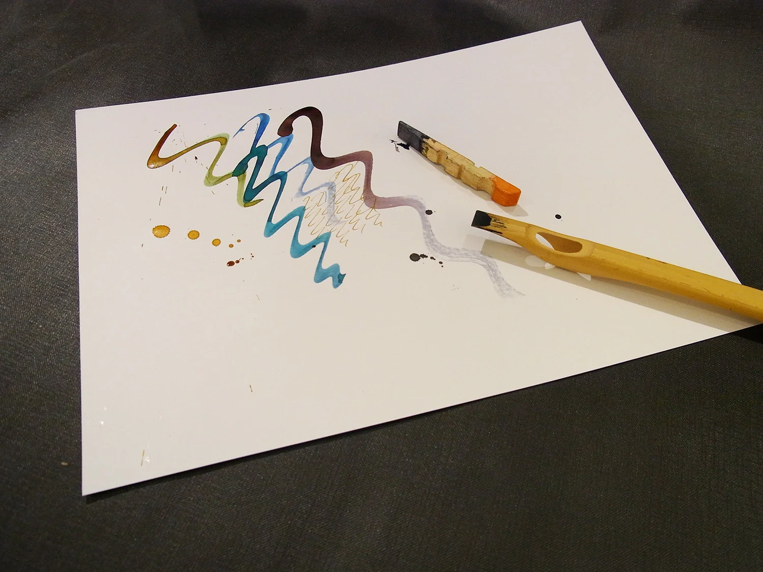
That freedom is what I found exciting. The tool does not dictate the design. The idea decides which tool is needed.
From the envelope to the wordmark
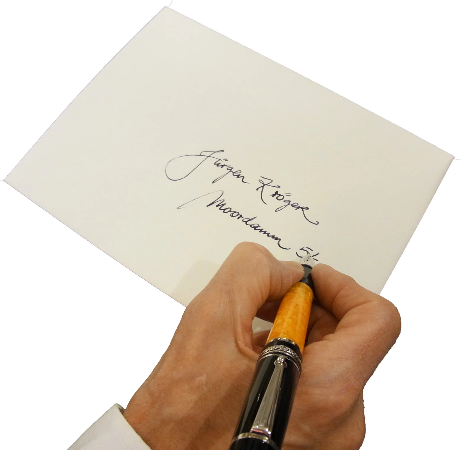
We used calligraphy for very different tasks: handwritten addresses on envelopes, place cards and name cards, invitations, thank you cards or single words within a design.
The logo of my home Couture also came from Michael’s hand.
A handwritten form became more than part of a card or an invitation. It became the basis of a wordmark.
For me that shows very nicely what handwriting can do.
Print, embossing and handwriting
What interests me most to this day is the way different techniques connect.
I like print, embossing and calligraphy as things that can complement each other. They do not belong to separate worlds.
A design can be printed, a detail embossed and a name added by hand afterwards.
And sometimes an idea comes about in a completely different way.
On one of our pieces a keyhole was embossed. Next to it went a circle set on the paper with the rim of an upturned glass dipped in red wine.
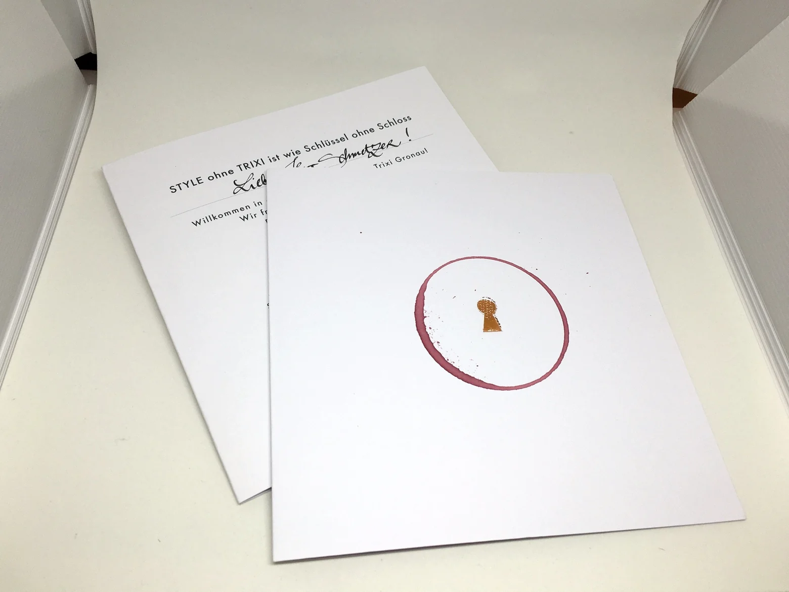
The red wine circle is of course not calligraphy. But that image tells you very well how I understand design: techniques, materials and ideas may come into contact with each other whenever the result is right.
“Nobody else has it quite like that.”
My sister often says to me:
“Nobody else has it quite like that.”
That sentence describes my attitude rather precisely.
Doing something merely because it is the usual thing to do holds no interest for me.
I like the unexpected. An unusual combination. A detail that makes a piece personal.
Calligraphic lettering carries the movement of the person who wrote it. You can leave it standing as a one off, reproduce it in print or combine it with embossing and other craft techniques.
That, for me, is where the appeal of calligraphy lies.