TRIXI GRONAU Manufactory · Knowledge
Paper Knowledge from our Hamburg Atelier
Why paper is more than weight
Paper is often described first by its grammage. For the effect of a printed piece, however, weight alone is not enough. Two papers with the same grammage can feel completely different because of their bulk, surface and fibre structure.
At TRIXI GRONAU, paper selection therefore never begins with a number alone. A sheet is looked at, handled, bent and considered together with the intended printing or finishing process. Grammage, bulk, colour, surface and grain direction all belong to the decision.
Paper is not a neutral carrier for us. It is part of the design.
Judging paper with eye and hand
Working with paper is part of the craft history of TRIXI GRONAU. Corinna Gronau grew up around paper in her parents' print shop and describes herself as a tactile person. Many qualities of a sheet can already be sensed by hand: thickness, bulk, firmness and surface texture.
This experience still shapes today's choices. A paper can feel smooth, soft, firm, open, structured or bulky. Only together with printing ink, embossing, handwriting or binding does it become clear whether it is right for a particular piece.
What does grammage mean?
Grammage is the weight of paper per square metre. A paper marked 300 g/m² therefore weighs 300 grams per square metre.
This figure is useful, but it does not describe the paper completely. Two papers with the same grammage can differ in thickness and stiffness. For business cards, TRIXI GRONAU usually works with substantial papers from around 300 g/m², but the overall feel and suitability remain decisive.
What does bulk mean?
Bulk describes, in simplified terms, how much thickness and body a paper has in relation to its weight. A bulky paper may feel more substantial even though its grammage is no higher than that of a denser sheet.
For letterpress and embossing, softer and bulkier papers can be especially interesting because they react differently under pressure than very dense, hard stock.
Why do surface and texture matter?
The surface influences both appearance and printing behaviour. Smooth papers perform differently from strongly textured ones. Examples of surfaces used in TRIXI GRONAU practice include hammer-finish and linen textures.
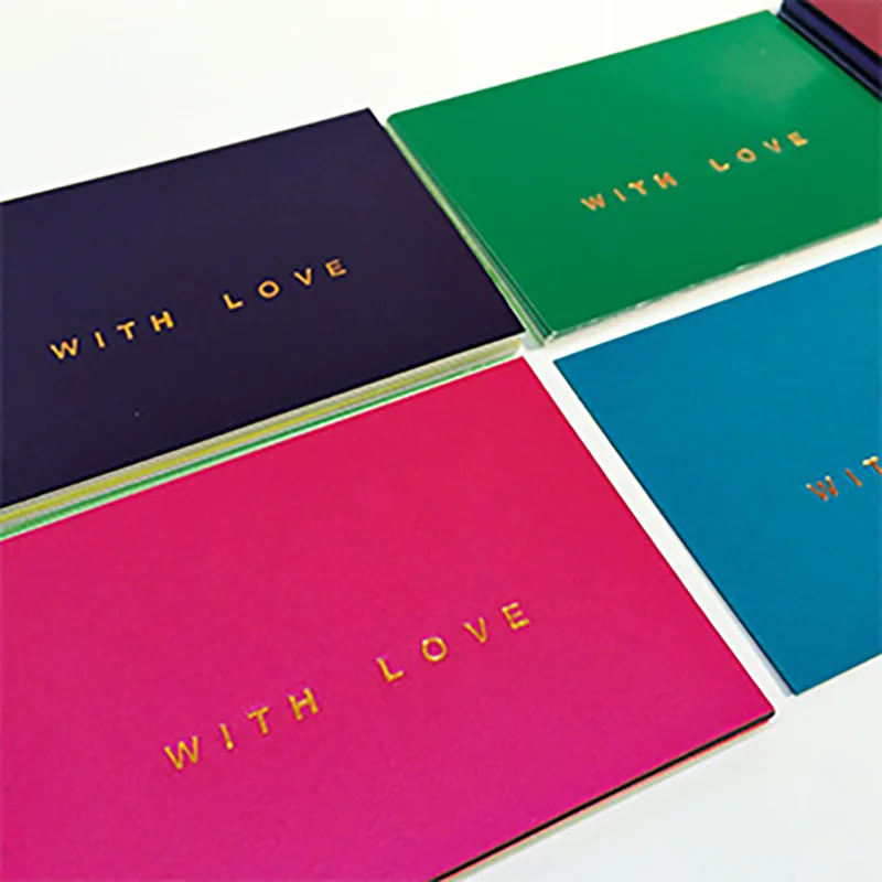
Paper colour is part of the effect as well. White, cream, strong colours, neon papers or glitter effects can change a design completely. For invitations, coloured, glittering or neon papers can therefore be a deliberate part of the concept.
Coated and uncoated papers
Coated papers have a treated surface that usually appears more closed and smooth. Uncoated papers feel more open and characteristically like paper.
Which option is better depends on the application. For embossing, TRIXI GRONAU often prefers soft, bulky and uncoated natural or cotton papers. For <a href="/wissen/thermography-raised-printing/">thermography</a>, smoother surfaces are generally more suitable. For handwriting and fountain pens, the way the surface accepts ink must also be tested.
Why is grain direction important?
During papermaking, fibres tend to align predominantly in one direction. This grain direction affects how paper bends, folds, scores and behaves in further processing.
In practice, grain direction matters for printing, scoring and bookbinding. A sheet bends with less resistance along the grain. A tear also tends to run straighter and more cleanly in the grain direction.
How can grain direction be identified?
TRIXI GRONAU uses three simple practical tests.
Bending test
The sheet is gently bent in both directions. Along the grain it gives more easily and shows less resistance.
Tear test
A tear tends to run straighter and more smoothly along the grain. Across the grain, the torn edge looks more irregular.
Moisture test
When a small piece of paper is dampened, it curls across the grain. This also helps identify the direction.
These tests are especially useful when grain direction is no longer marked on a cut sheet.
Which paper is suitable for letterpress?
For letterpress, TRIXI GRONAU prefers papers with a high cotton content and plenty of bulk. The paper should be able to receive the intended impression while still fitting the design.
In contemporary letterpress, a light to clearly tactile impression may be a deliberate part of the design. A soft, bulky paper supports this effect better than a very hard and compact stock.
Which paper is suitable for embossing?
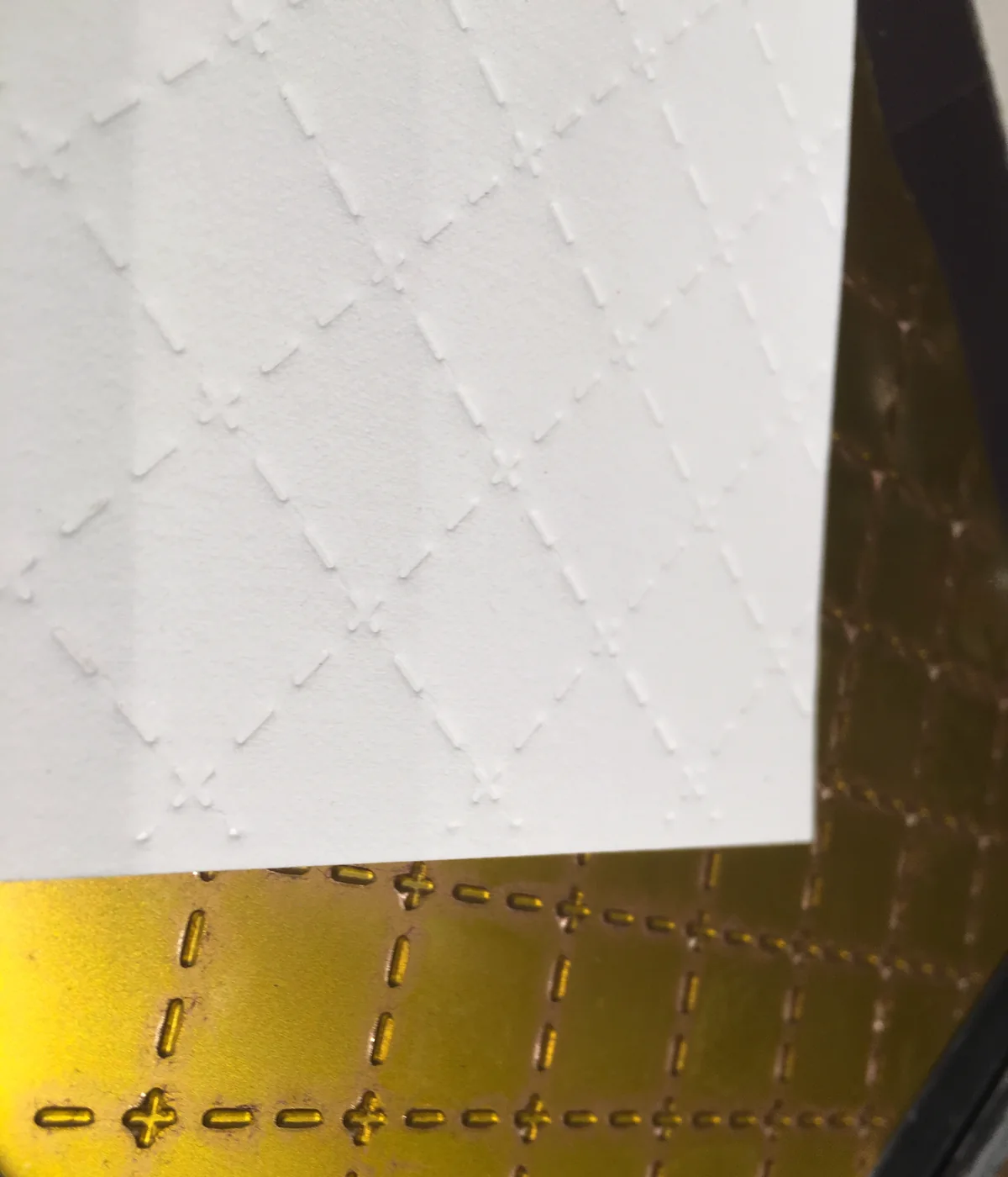
Soft, bulky and uncoated natural or cotton papers are particularly interesting for embossing because they can respond well to pressure from the die.
With <a href="/wissen/hot-foil-stamping/">hot foil stamping</a>, surface characteristics become an additional factor. Texture, coatings or previously finished surfaces can make clean foil transfer more difficult. A test impression is therefore part of the material decision.
Which paper is suitable for thermography?
For raised printing or <a href="/wissen/thermography-raised-printing/">thermography</a>, TRIXI GRONAU tends to prefer smoother paper surfaces. The raised ink layer should form clearly and evenly. Strongly textured papers can be more demanding for fine type and lines.
Which paper is suitable for screen printing?
Hand screen printing can be particularly effective on dark paper. The choice depends on paper colour, surface and the ink being used. As with other craft processes, the material has to fit both the design and the intended colour effect.
Paper for fountain pens, ink and calligraphy
For correspondence cards and personal stationery, the printing process is only one part of the decision. The paper must also suit the way the piece will later be used.
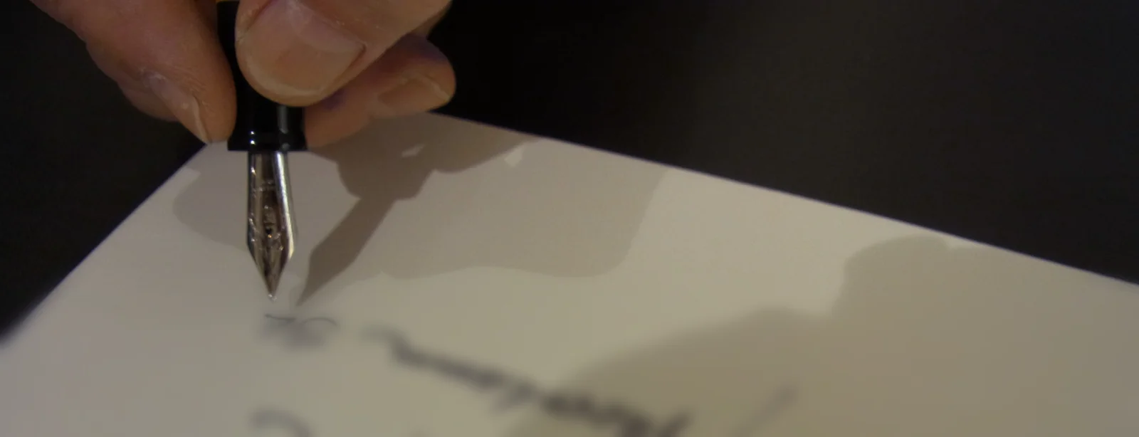
Cards can be white or cream, smooth or textured. What matters is that they can be written on cleanly with ink. Coated papers can sometimes be unsuitable for fountain pens. Ink should not feather excessively, spread or form unwanted droplets on the surface.
Drawing ink such as Scriptol can be used with ruling pens or dip tools, but it is not intended for fountain pens. Paper and writing medium must therefore always be considered together.
What is mould-made or handmade paper?
Corinna Gronau has had personal experience with traditional papermaking since early on. Together with her mother, she visited the Gmund paper mill at Tegernsee and made paper by hand. She remembers unusual inclusions such as beer, scattered flower petals and hemp fibres.
Traditional deckle-edged paper from Römerturm also played an important role in the past. In the TG Glossary, this subject therefore represents not only a type of paper but also a link between material knowledge, craft and personal experience.
Which papers belong to TRIXI GRONAU practice?
Precioso by Römerturm is one of the papers Corinna particularly values. In addition, TRIXI GRONAU currently uses and selects papers from the ranges of Fedrigoni, Römerturm, Michaelis & Co., MetaPaper, Crown Mill and Gmund.
No single paper is treated as the universal standard. The choice changes according to application, colour, surface, grammage and printing or finishing process.
Why do paper and envelope belong together?
With a card, the design does not stop at the edge of the card itself. The colour, weight, surface and feel of the envelope contribute to the overall impression.
TRIXI GRONAU therefore treats card and envelope as related design elements. Crown Mill is one example of cards and envelopes used in this context.
Paper choice by technique
Paper selection always depends on the process. A stock that is ideal for letterpress is not automatically the best choice for thermography or handwriting.
As a practical guide from TRIXI GRONAU experience:
- Letterpress: high cotton content and plenty of bulk.
- Embossing: soft, bulky, uncoated natural or cotton paper.
- Thermography: generally smoother surfaces.
- Screen printing: choose paper colour and surface deliberately in relation to the ink; dark papers can be especially effective.
- Fountain pens and ink: always test writing behaviour in practice.
- Invitations: coloured, glittering or neon papers can be part of the design.
Why does paper knowledge belong in our glossary?
Many printing and finishing techniques can only be understood properly when the material is considered as well. Printing ink, foil, dies and printing forms never act independently of the paper.
Paper knowledge therefore connects <a href="/wissen/letterpress/">letterpress</a>, <a href="/wissen/offset-printing/">offset printing</a>, <a href="/wissen/thermography-raised-printing/">thermography</a>, screen printing, <a href="/wissen/blind-embossing/">blind embossing</a>, <a href="/wissen/hot-foil-stamping/">hot foil stamping</a>, calligraphy and bookbinding. It explains why the same technically correct process can look and feel completely different on two different papers.
Frequently asked questions
Is a higher grammage automatically higher quality?
No. Grammage is only one characteristic. Bulk, surface, fibre structure, colour and suitability for the intended process matter just as much.
Why do I need to know the grain direction?
Because paper behaves differently along and across the grain. This affects bending, scoring, folding and bookbinding.
How can grain direction be identified?
With the bending test, tear test or moisture test. Paper bends more easily along the grain, tears more cleanly in that direction and curls across the grain when dampened.
Which paper works well for letterpress?
TRIXI GRONAU prefers a high cotton content and plenty of bulk. The exact paper is always chosen together with the motif, printing form and desired impression.
Can every paper be written on with a fountain pen?
No. Surface and coating affect writing behaviour. The paper should be tested to make sure ink does not feather excessively or spread.
Can textured paper be hot foil stamped?
Yes, but it can be more demanding. Texture and coatings influence foil transfer, which is why a test impression is important.