TRIXI GRONAU Manufactory · Knowledge
Handwriting, Calligraphy and Print
Three ways of designing with lettering
Handwriting, calligraphy and print belong together for me, and each of them has a strength of its own.
Handwriting is immediately personal.
Everyone writes differently. It usually happens spontaneously and naturally carries the movement and the quirks of the person writing.
Calligraphy is designed more deliberately.
Here the tool, the ink, the paper, the rhythm and the movement shape the lettering. A name or a word is given a particular effect on purpose.
Print, in turn, can be repeated exactly.
A letter or a text, once designed, stays the same every time it is used again. That is what makes print right for larger runs and for designs that need to be reliably reproducible.
Handwriting is personal
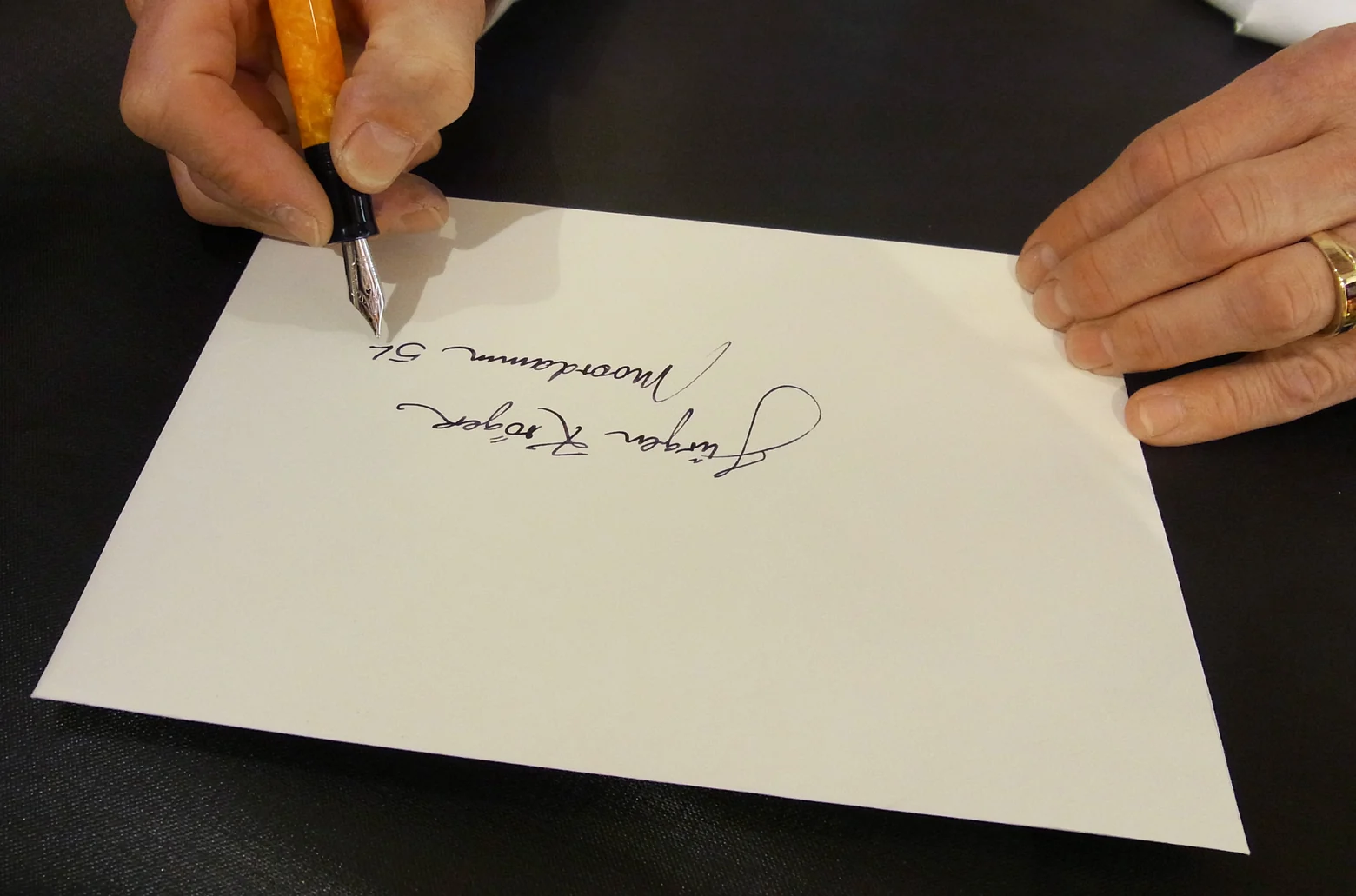
Handwriting does not have to be perfectly even.
It is the small differences that make it unmistakable.
For private notes or personal additions that is often exactly right. It reads directly and clearly belongs to the person who wrote it.
Calligraphy is deliberately designed
In calligraphy, lettering is designed as much as it is written.
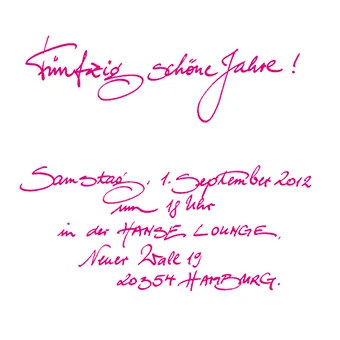
Depending on the commission it can read fine, generous, classic, pared back or very free.
Classic nibs can be used for it, and so can brushes, glass pens, quills, fibre tip pens or other tools.
What decides it is the effect that should come about, more than the tool alone.
Print is reproducible
Print has a different job to do.
It lets a design be produced repeatedly in the same form.
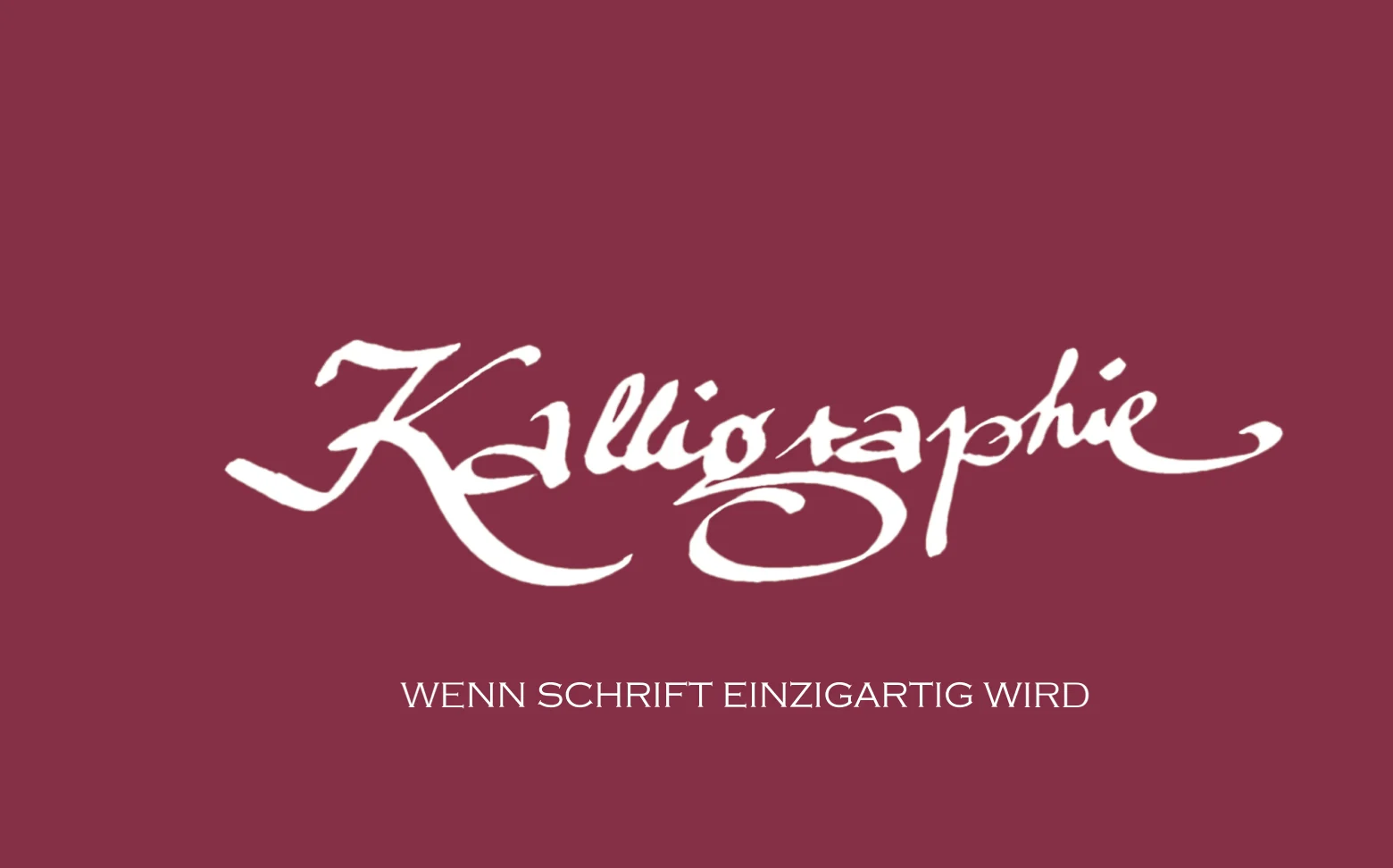
That matters above all when a handwritten idea is to become a larger run, or when an invitation, a thank you card or a greeting card is needed in several copies.
Why choose, when you can combine?
For me this is exactly where it gets interesting.
An invitation can be printed and the name of the guest added by hand afterwards.
A calligraphic original can be digitised and then printed in a larger run.
A design can also be combined with embossing, which gives it one more layer of craft.
So there is no need to choose between handwriting, calligraphy and print.
Each technique can be used where it has its own strength.
One off piece and printed run
The link between a handwritten original and print always fascinated me in our manufactory.
A handwritten word or a whole text keeps its movement and its effect, and can still be prepared technically so that a run comes out of it.
The other way round, a printed piece becomes individual again through a single handwritten name.
It is this shift between the one off and the repeatable that opens up so many possibilities.
Design happens in the combination
In our work, handwriting, calligraphy, print and embossing were therefore never strictly separated.
One technique does not have to do everything.
Handwriting brings personality.
Calligraphy brings deliberate design.
Print brings repeatability.
And when those things come together sensibly, that is often where I find the most interesting solution.
Every technique can be used exactly where its own strength lies.