TRIXI GRONAU Manufactory · Knowledge
Place Cards and Name Cards
A name belongs to the design of the table
A place card has a practical job first of all: the guest should find their seat.
For me that is not enough.
A good place card has to be part of the table setting at the same time. Paper, lettering, colour, format and any finishing should belong to the laid table as naturally as the china, the glasses or the flowers.
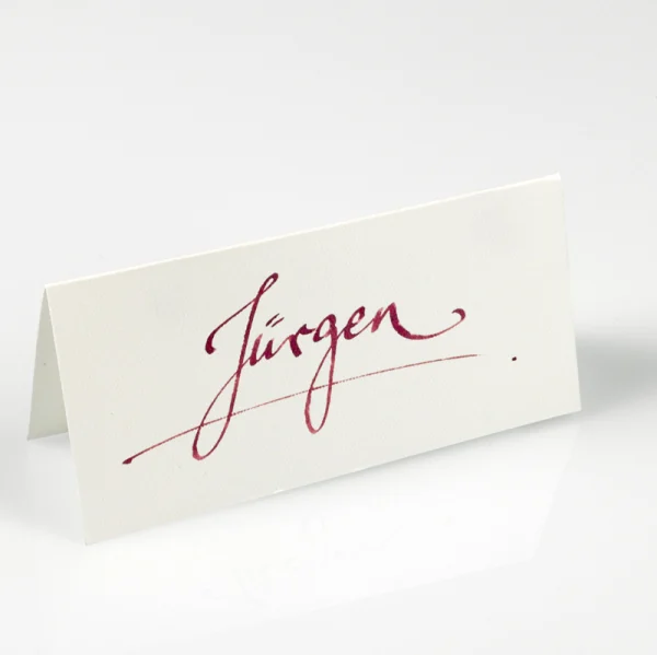
We have made place cards and name cards for very different occasions. Private dinners, weddings, company events or large receptions. What always decided the outcome was the design for that particular occasion.
Written entirely by hand
Our place cards were lettered completely by hand.
They could be classic small folded cards or little tags worked into the decoration.
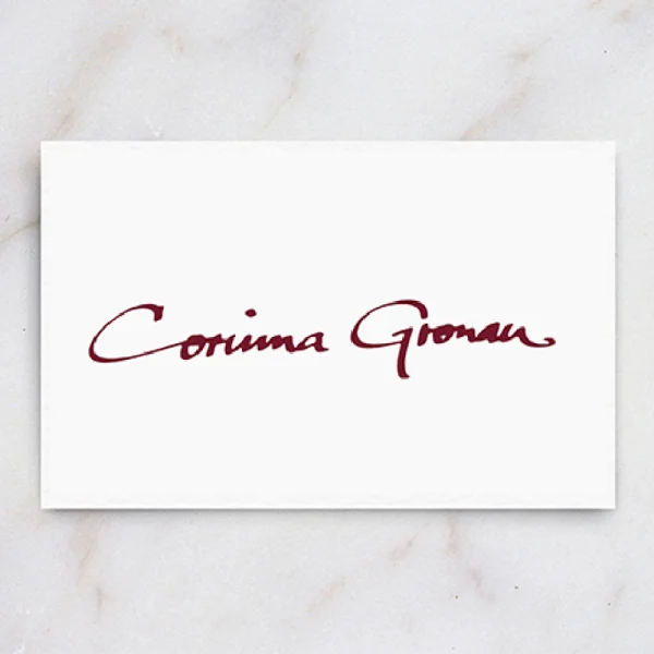
We usually received the names as a list beforehand. After that we settled which lettering, which colour and which card format suited the occasion.
Through all of the design work one point always mattered to me:
The name has to stay legible.
A guest should not have to lean far across the table to work out whether they are in the right seat.
Colour and paper follow the table
The paper colour was chosen to match the table decoration.
In the same way, the colour of the lettering could pick up the invitation, the decoration or, at business events, the corporate identity.
That way the place card became part of the whole concept instead of a sign placed there afterwards.
Embossing and small applications
Place cards could be finished further.
We have stamped cards with hot foil or added small applications.
On a small format it often takes very little. A single detail can be enough to tie the card to the rest of the design.
When a goose becomes the place card
There is one commission I remember especially fondly.
At a goose dinner, a small porcelain goose stood in front of every guest.
We lettered small tags by hand with the individual names and tied them around the necks of the geese.
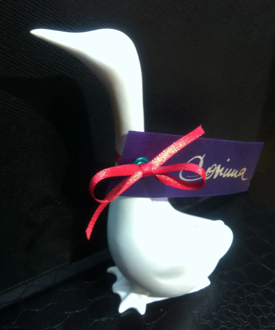
So the place card did not simply stand in front of the plate. It became part of the decoration itself.
For me that example shows beautifully how function and design can come together.
Orientation sometimes begins before the table
At larger events we did more than write the individual place cards.
For a large Hamburg caterer we also produced seating plans in calligraphy.
The seating plan and the individual name cards had to belong together visually so that guests could find their way quickly.
Specific events or guests are not for the public. What counts is the craft principle behind them.
Prepared for last minute changes
At an event something can always change.
That is why we handed over blank cards as well.
Whenever we had the ink or the matching fibre tip pen to spare, we passed those on or lent them out too.
A name could then be added or a card replaced at short notice, without it looking any different from the rest.
For me that is as much part of the commission as the writing itself.
Design has to work
A place card may be beautiful. It also has to work.
The guest has to recognise their name, find their seat, and at the same time the card should sit naturally within the table setting.
When both of those come together, the place card is part of the laid table as well as a piece of orientation.