TRIXI GRONAU Manufactory · Knowledge
Offset Printing
With offset printing, a new era began
For me, offset printing is not only part of the history of printing but also part of my own family history.
In my father's printing works we lived through the change from the older typesetting and printing techniques to a new era.
A Linotype-Hell computer workstation arrived in our typesetting and prepress department. My father travelled to Frankfurt to be trained on it.
All of a sudden, floppy disk drives, digital typefaces and programs such as QuarkXPress were part of everyday work. Today a lot of that work would be done in something like Adobe InDesign.
In the past you needed an extensive stock of type for all the different typefaces. Computer typesetting changed that completely. Suddenly a great many more typefaces were available digitally.
For us, that really was the beginning of a new age in printing.
From the design to the printing plate
My father was not only a printer but also a graphic designer.
During our time in Switzerland, where among other things he played professional football for Grasshoppers Zürich, he also worked for a well-known agency.
Design and printing therefore always belonged together for him.
A job began with the customer's wishes. The design grew out of them.
After that the text was set and the artwork prepared. Text and images were exposed onto film with reprographic cameras, the individual elements were assembled by hand and then transferred to a printing plate.
To do that, the film was laid on the printing plate and exposed.
The plate then went into the offset press.
Why is it called offset printing?
In offset printing the ink does not go directly from the printing plate onto the paper.
The printing plate is dampened with water by a dampening unit. The non-printing areas take up the water and repel the oil-based ink. The printing image areas behave in exactly the opposite way: they take up the ink.
The printed image is first transferred to a rubber blanket cylinder and only from there onto the paper.
That indirect transfer is precisely the principle of offset printing.
The Heidelberg GTO
My father always moved with the times when new technology came along.
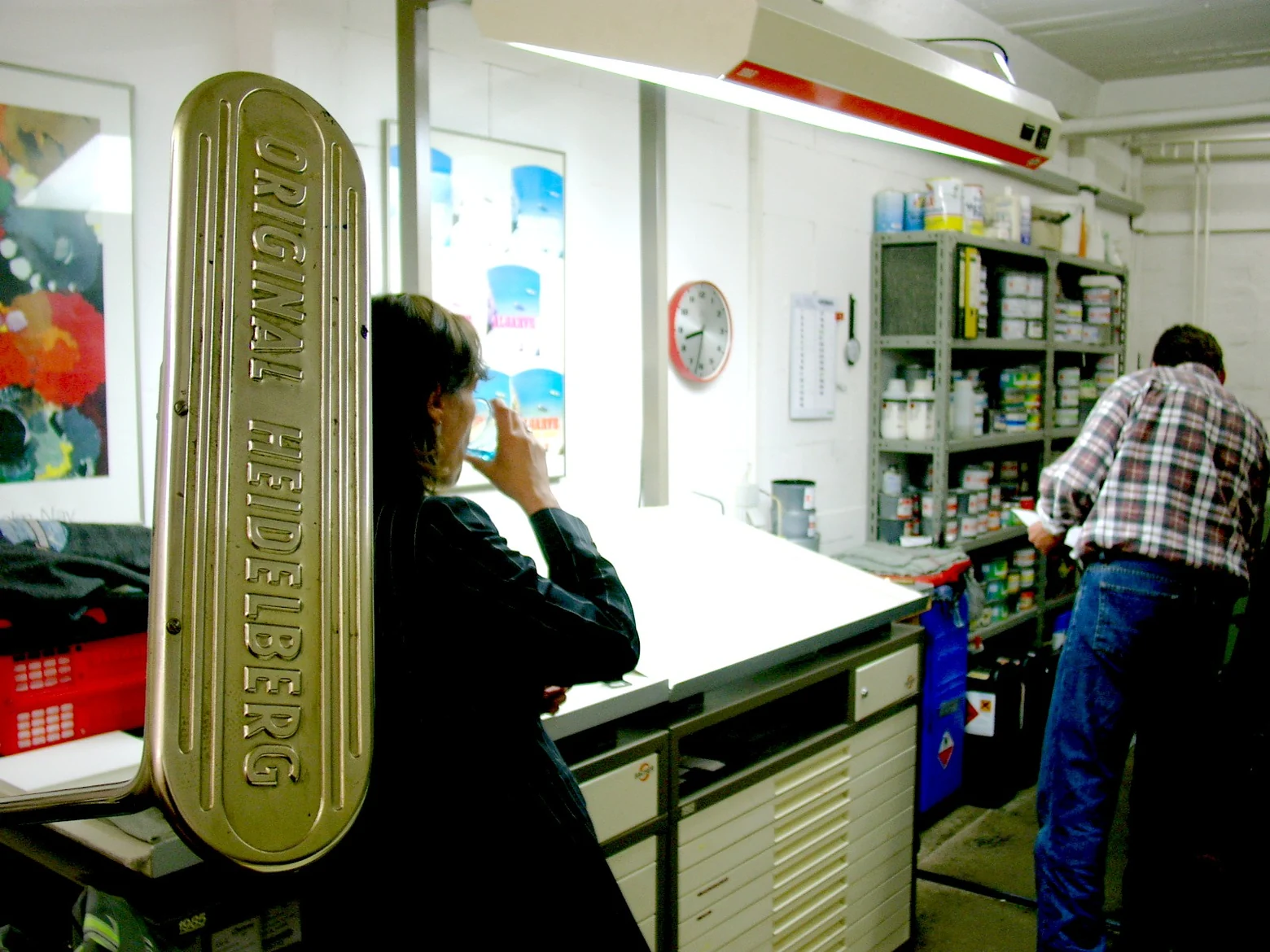
That is why he bought a Heidelberg GTO for our printing works.
For me that press is one of the earliest memories of offset printing in our family business.
Later, large four-colour presses were added.
As a child I found these machines enormous. They took up an incredible amount of space, and the sound of them running was simply part of the atmosphere of the printing works.
My sister and I more or less grew up in that environment.
What we made in offset
We produced a great deal in offset printing.
That included business stationery, letterheads, business cards, invitations, brochures, leaflets, catalogues, belly bands and flyers.
Images were usually built up in four colours from cyan, magenta, yellow and black.
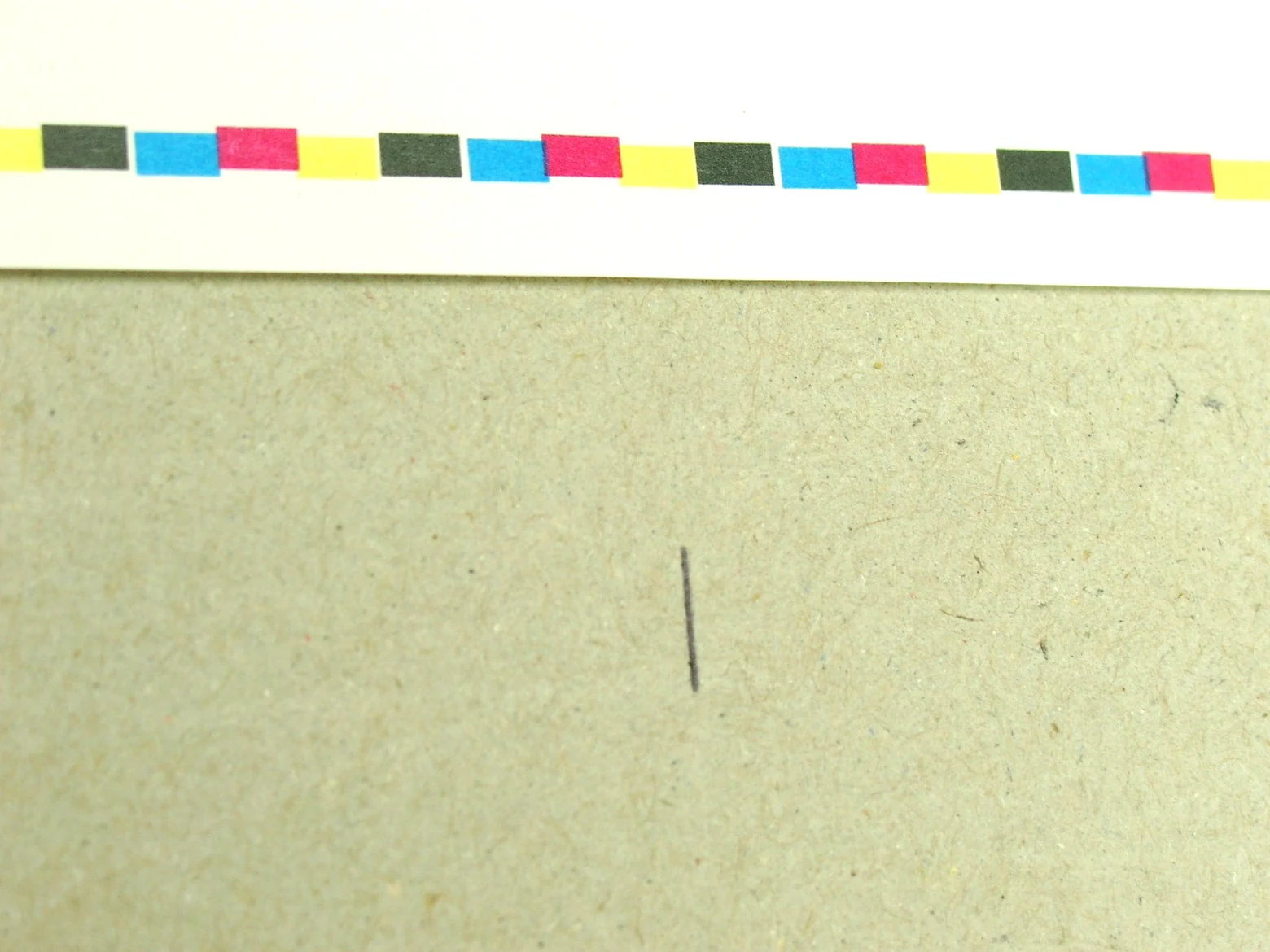
For business stationery, business cards, letter paper or invitations, on the other hand, we very often worked with a specified spot colour.
HKS colours were particularly important there.
Four colours for images, spot colours for the brand
For me, one of the great strengths of offset printing is still the possibility of working with a true spot colour.
If a company had laid down a particular corporate colour in its corporate identity, that colour had to be matched as closely as possible.
Agencies and customers rightly insisted on colour accuracy. After all, the colour is part of the identity of the company.
With an HKS spot colour, exactly that shade is used as an ink in its own right.
That is visibly different from a shade built up purely from cyan, magenta, yellow and black.
If you look at a four-colour print under a magnifying glass, you can see the individual screen dots of the process colours.
With a spot colour printed on its own, you see the chosen colour itself.
With business cards, letter paper, invitations or condolence cards in particular, I still like that effect very much.
Paper changes the colour
A specified spot colour does not look exactly the same on every paper.
The colour of the paper, the surface and the absorbency all influence the way the print looks.
Even with a type of paper whose composition ought to stay the same, different production batches can behave differently.
Which raw materials a paper mill uses and how the paper was made can affect the way the colour looks.
That is why an important corporate colour always had to be judged together with the paper it was going to be printed on.
A colour number on its own is not enough for that.
Water, ink and register all have to be right
In offset printing, many factors have to be right at the same time.
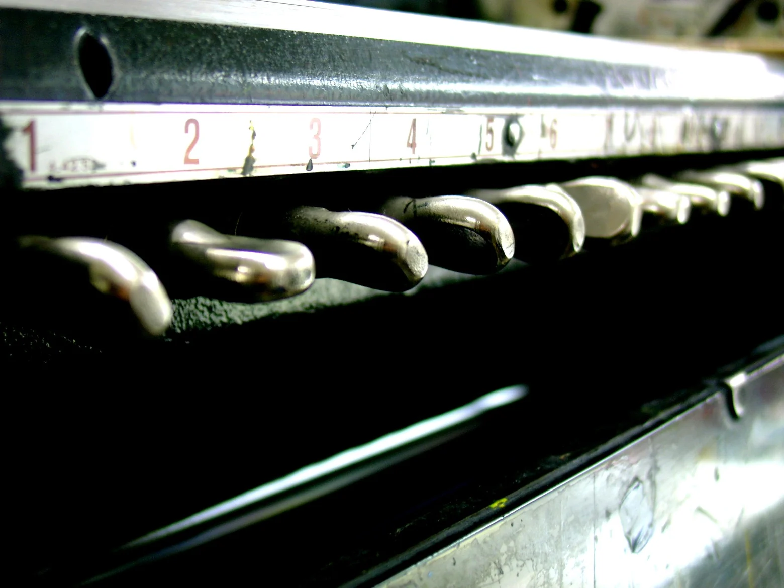
The balance between ink and dampening solution is especially important.
If too much water is used, the paper can start to cockle.
With multi-colour work that can in turn mean that the individual colours no longer sit exactly on top of one another.
The register is then out.
Ink levels, paper and press settings also have to be checked constantly.
A good print is therefore not simply a matter of switching the press on.
You have to watch and judge the print throughout the whole run.
When it had to be quick
Customers naturally wanted their printed work very quickly sometimes.
Freshly printed ink needs time to dry, though.
When a job had to be finished particularly quickly, we therefore sometimes interleaved the sheets.
That means a blank sheet was laid between each of the freshly printed sheets.
That way the printed areas were less likely to set off against each other while being stacked and finished.
Cutting in particular puts pressure on the pile of paper. If the ink is not completely dry, that can otherwise leave marks.
Small working steps like that were simply part of everyday life in the printing works.
When the run got bigger
Some jobs were so large that we printed in shifts.

The presses then kept running for many hours.
In times like that my father even slept at the printing works so that he could keep an eye on the run and step in immediately if there were problems.
The work was far from over once the printing was done, though.
After that came the bookbinding.
My mother and our second bookbinder took on that part of the production. Sheets were cut, folded, gathered and finished.
My sister and I grew up between typesetting, printing presses and the bindery.
For us those areas always belonged together.
Perhaps that is also where my attitude to this day comes from: for me a printed product never consists of the printing alone. Design, type, paper, colour, printing and finishing form a whole.
Offset printing or digital printing?
Both processes have their place.
Digital printing is particularly practical for small runs, changing content or personalisation.
With offset printing I value above all the controlled colour and the possibility of working with true spot colours.
With business cards, letter paper, invitations or condolence cards in particular, I still find a cleanly printed spot colour in offset very beautiful.
Which technique is the right one therefore always depends on the job.
Run length, design, paper, colour and the result you want have to be looked at together.
Why offset printing is more than a printing technique for me
When I think about offset printing today, I do not just see printing plates, rubber blankets and inking units.
I see my father's Heidelberg GTO, the large four-colour presses, the typesetting workstation, films and printing plates.
I see my mother in the bindery and my father watching over a large run at night as well.
And I see my sister and myself between all those working areas.
We grew up in the printing works.
Perhaps that is exactly why, to this day, I cannot separate design, printing and finishing from one another.