TRIXI GRONAU Manufactory · Knowledge
Paper Types and Paper Weights
I do not choose paper by a number
When I choose a paper, I never go by colour or weight alone.
I take it in my hands.
How does it feel? How firm is it? What is the surface like? How does it behave when you write on it, print on it, emboss it or fold it?
Two papers can have the same weight and still feel completely different.
That is why, for me, paper is never simply the backdrop to a design.
It is part of the design.
What does paper weight mean?
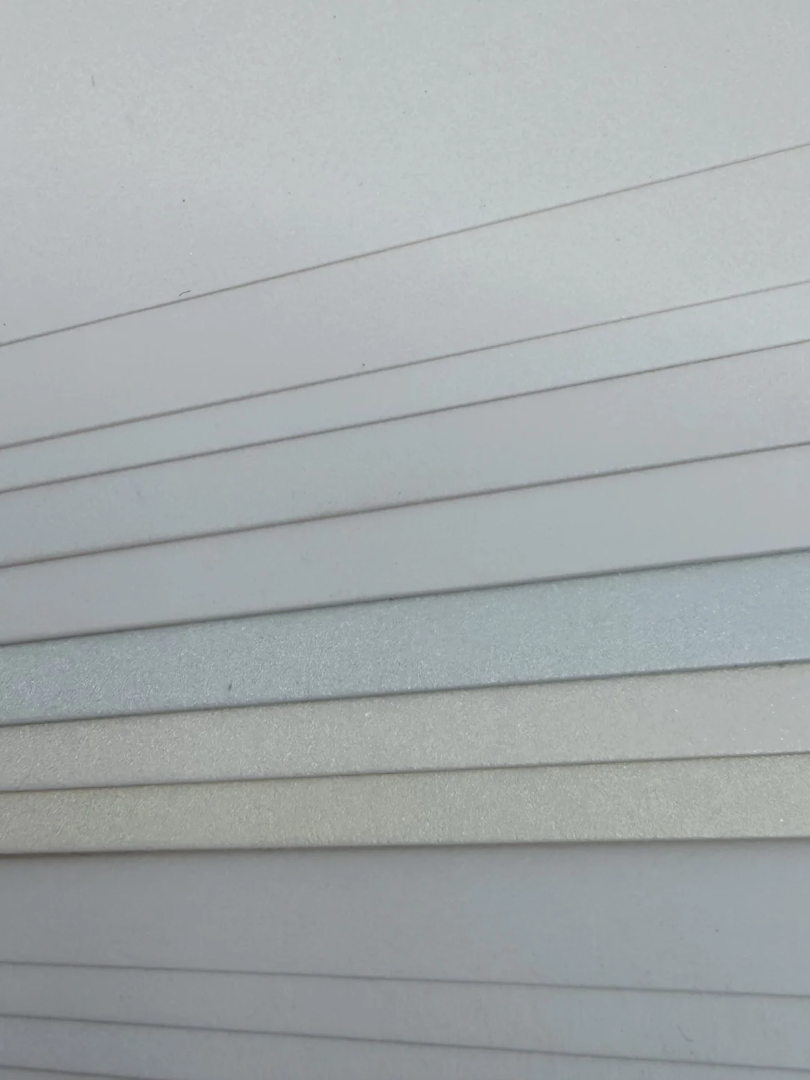
Paper weight describes what a paper weighs in grams per square metre.
It does not automatically tell you how thick or how firm a paper will feel.
At the same weight, a bulky natural paper can feel far more substantial than a denser, smoother one.
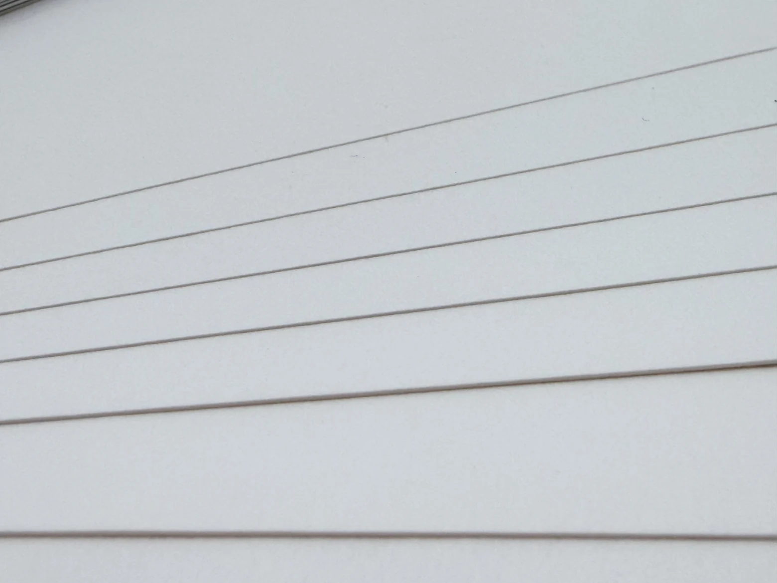
So the number on its own is never enough for me.
I look just as closely at bulk, firmness and surface, and at what is going to happen to the paper afterwards.
For me, letter paper needs a certain firmness
For large quantities, a lighter letter paper was often chosen in the past.
There were usually two reasons for that: the customer wanted to save on paper costs or to keep the weight down for postage, especially when several sheets went out in one letter.
A paper of around 90 gsm might be used for that.
Personally, I prefer letter paper a little more substantial.
My own recommendation is more like 100 to 110 gsm.
It should feel like proper paper and still be pleasant to write on.
I am also very fond of fine letter papers with a watermark.
For me, a good letter paper should do more than take print. It should be just as natural to sit down later with a fountain pen and ink and write on it.
Letter cards should have substance
With a letter card I expect more firmness.
That is why, for me, a good letter card starts at around 300 gsm.
It sits differently in the hand than a thin board, and the material alone already carries a sense of quality.
Here too, the weight is not everything.
A bulky board can have a different effect from a very dense board of the same grammage.
But a letter card should have enough backbone.
A business card should feel right in the hand
For business cards I also prefer 300 gsm or more.
A business card is picked up, handed over and often kept.
Paper, colour, print and any finishing should therefore work together.
A special colour in offset printing or an embossing in particular can look completely different on a good board than on just any material.
For invitations, the format makes a difference
With invitations I distinguish between a single card and a folded card.
A single invitation card can comfortably be made from a heavier stock.
For me, 300 gsm or more is a good starting point.
And sometimes it can go a good deal heavier.
A board of 400 or even 500 gsm can be very striking with a pared back design.
With a folded card, on the other hand, the material has to crease and fold cleanly.
Here you can achieve very good results from around 246 gsm upwards.
What matters in the end is always how the paper behaves once it has been finished.
White is not simply white
There are considerable differences between white papers too.
A white can look warm, cool, cream coloured or almost bluish.
Then there is the surface: smooth, slightly rough, laid, felt marked or distinctly textured.
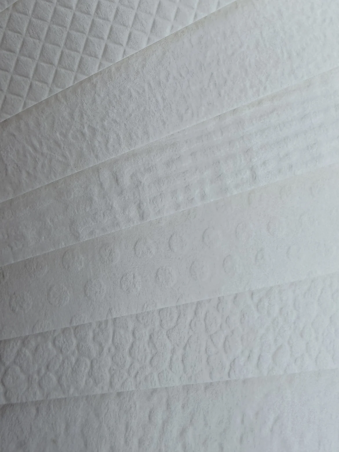
Put several white papers side by side and those differences suddenly become very clear.
That is why, for me, even choosing a white paper is a decision about colour.
Smooth or with just a hint of texture
For letter paper and letter cards I like a smooth surface or just a hint of roughness.
That is a particular pleasure to write on.
A fountain pen should glide across the paper and the ink should sit cleanly on it, without soaking into the surface in an uncontrolled way.
With letter paper that matters a great deal to me.
A paper can look as beautiful as you like: if it is not pleasant to write on later, then for me it is not the right paper for that purpose.
With invitations, the paper itself can make a statement
With invitations I am far more open.
Here the paper itself can already become part of the design.
It may have an unusual colour, a strong texture or a special embossed surface.
A paper with a lizard texture or lizard embossing can be very exciting too, as long as it suits the occasion and the design.
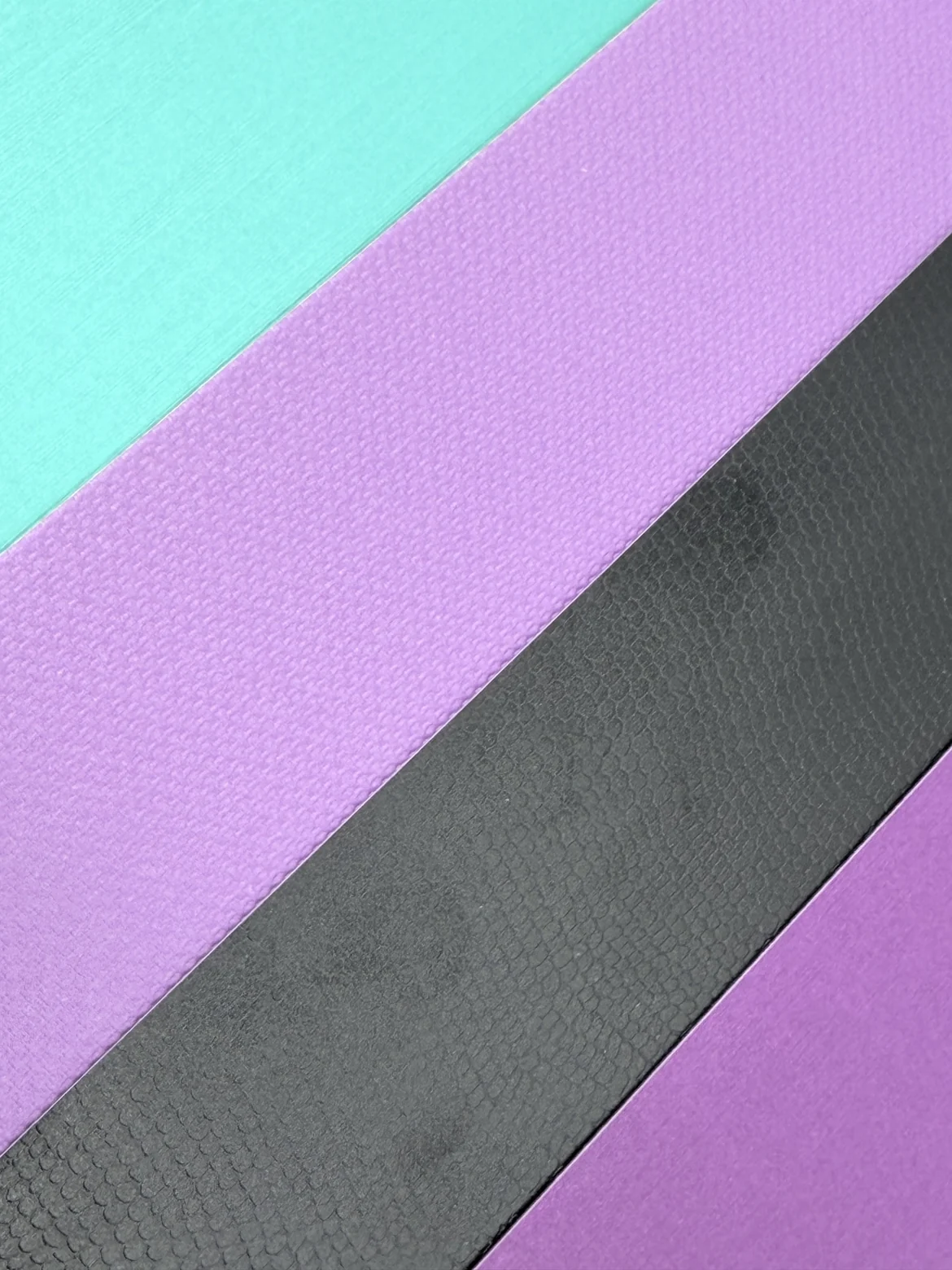
Then, more often than not, very little else is needed.
Restrained typography or a single embossing can be quite enough, because the paper itself already creates much of the effect.
Those are exactly the combinations I like.
Not every surface suits every technique
An unusual paper is only a good choice, though, if it also suits the finishing you have in mind.
For calligraphy, the surface has to be able to take the ink and the tool.
With hot foil stamping you have to check whether the foil sits cleanly on the material.
With blind embossing, thickness and surface decide how sharply the motif comes out.
With letterpress the bulk of the paper plays an important part as well.
And in offset printing, the paper colour, the surface and the absorbency all change the way the printing ink looks.
That is why we never choose the paper independently of the technique.
Paper weight and finishing belong together
A particularly heavy board can be beautiful and still be unsuitable for a certain kind of finishing.
If a card is to be folded, it has to be possible to crease it cleanly first.
Embossing, die cutting, laminating and bookbinding each place different demands on the material.
That is why I always start the paper selection with a very practical question:
What is going to happen to this paper afterwards?
Only then can you sensibly decide which weight and which surface are right.
Paper is part of the design
For me, designing often begins with the choice of paper.
The highest weight is not automatically the best one.
And the most eye catching paper is not automatically the most interesting one.
For a letter paper the right choice can be a beautiful smooth paper with a watermark.
For a letter card a firm board from 300 grams upwards.
And for an invitation perhaps a 400 or 500 gram board or a surprisingly textured surface.
What always matters to me is that paper, design and finishing fit together.