TRIXI GRONAU Manufactory · Knowledge
Skivertex and Pellaq
Covering materials that have to prove themselves in use
With books, albums and folders, the way a covering material looks is only part of what matters to me.
It has to be easy to work with, feel good in the hand and still look good after repeated use.
That is why we have enjoyed working with Skivertex and Pellaq in our atelier for many years.
Both materials come in a wide range of colours and surfaces. They can be smooth and restrained or, with a more pronounced texture, come remarkably close to the look and feel of leather.
In our workshop, we work with Skivertex and Pellaq in essentially the same way.
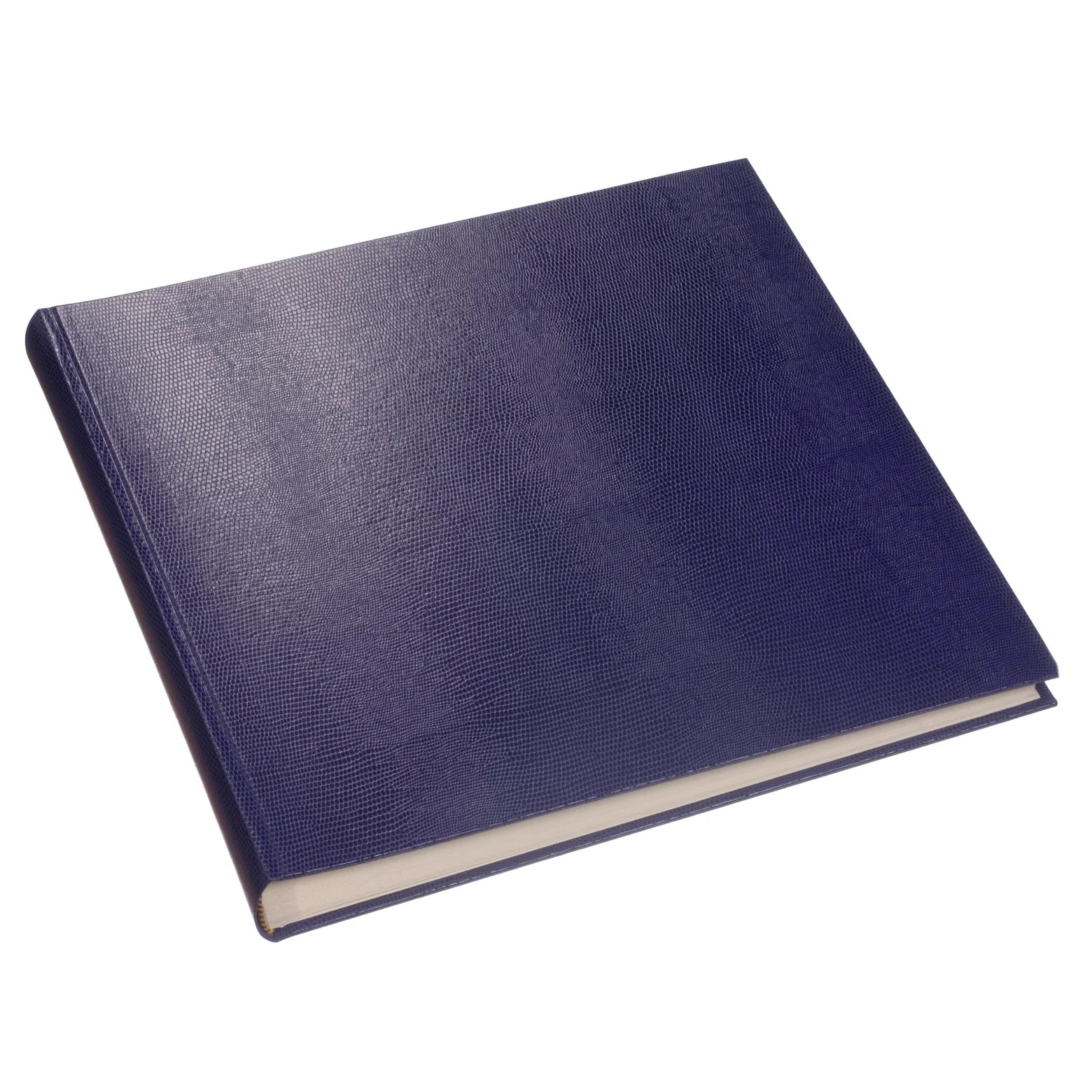
What are Skivertex and Pellaq?
Skivertex and Pellaq are coated covering materials with a paper base.
Their surfaces can imitate a range of leather textures, from very fine and quiet through to heavily grained or exotically embossed.
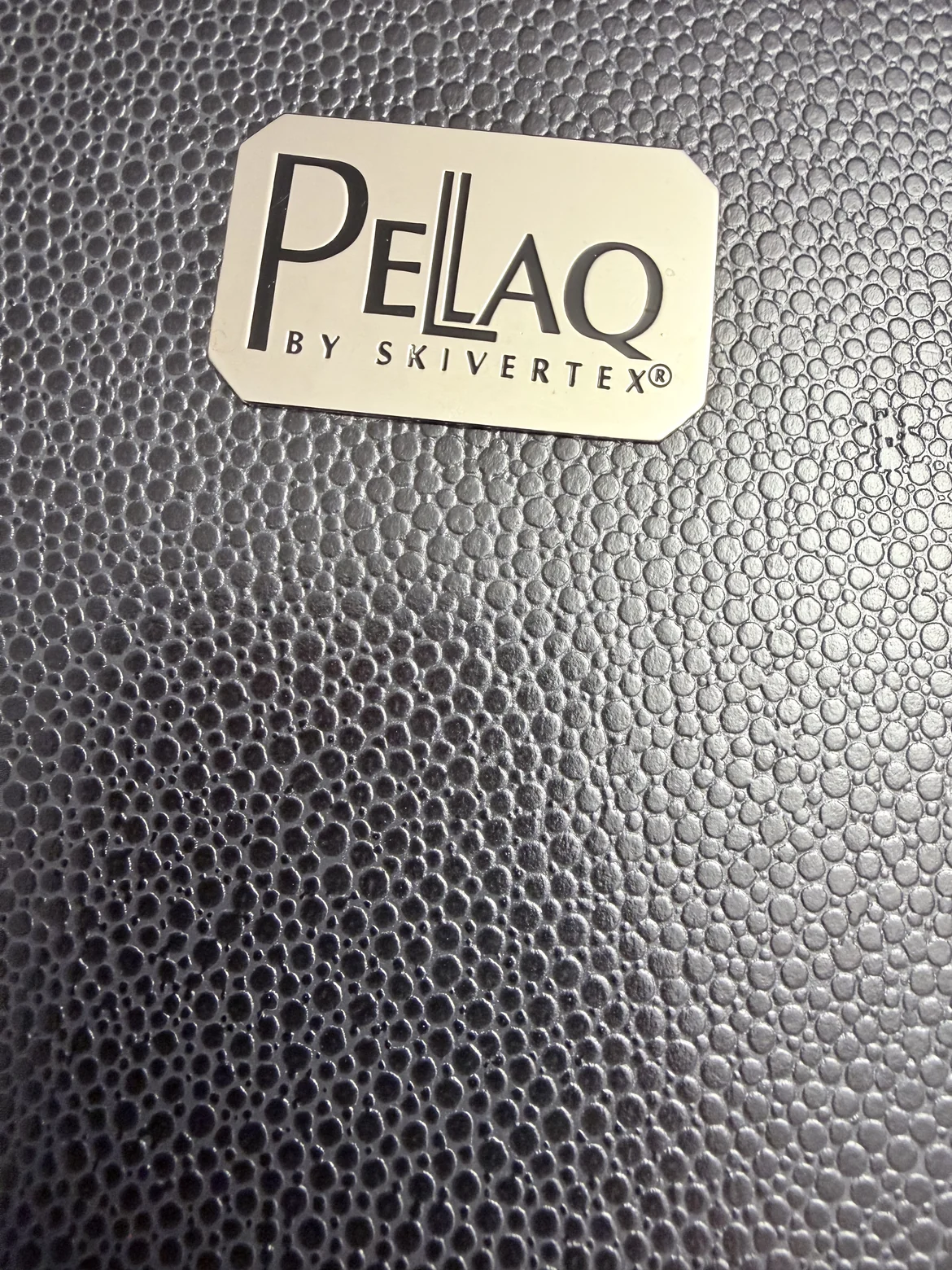
That variety is exactly what makes them interesting to me.
When I am developing a design, I choose not only the colour but also the surface and feel that suit it.
The material becomes part of the design itself.
What we use Skivertex and Pellaq for
We use these materials mainly for bookbinding work.
They go into books, photo albums, notebooks, covers for pads, folders and small envelopes.
The covering material is mounted on the prepared board, or on whatever the backing happens to be, and worked around the edges.
With books and albums in particular, the material has to allow clean, precise work and be durable enough for regular use.
Why I often prefer these materials to bookcloth
Many traditional binderies like to use bookcloth or marbled paper for books, folders and menus.
For a lot of purposes I am less keen on that.
With anything that gets picked up often, the difference shows quickly.
Cloth covered menus in restaurants are a familiar example. After a lot of handling the edges can darken and the surface soon looks worn.
Skivertex and Pellaq stand up to that kind of use far better.
Skivertex can be wiped down gently with a slightly damp cloth if it needs it.
For anything in regular use, that counts for a great deal in my view.
A covering material has to do more than look good. It has to prove itself in use.
From quiet to striking
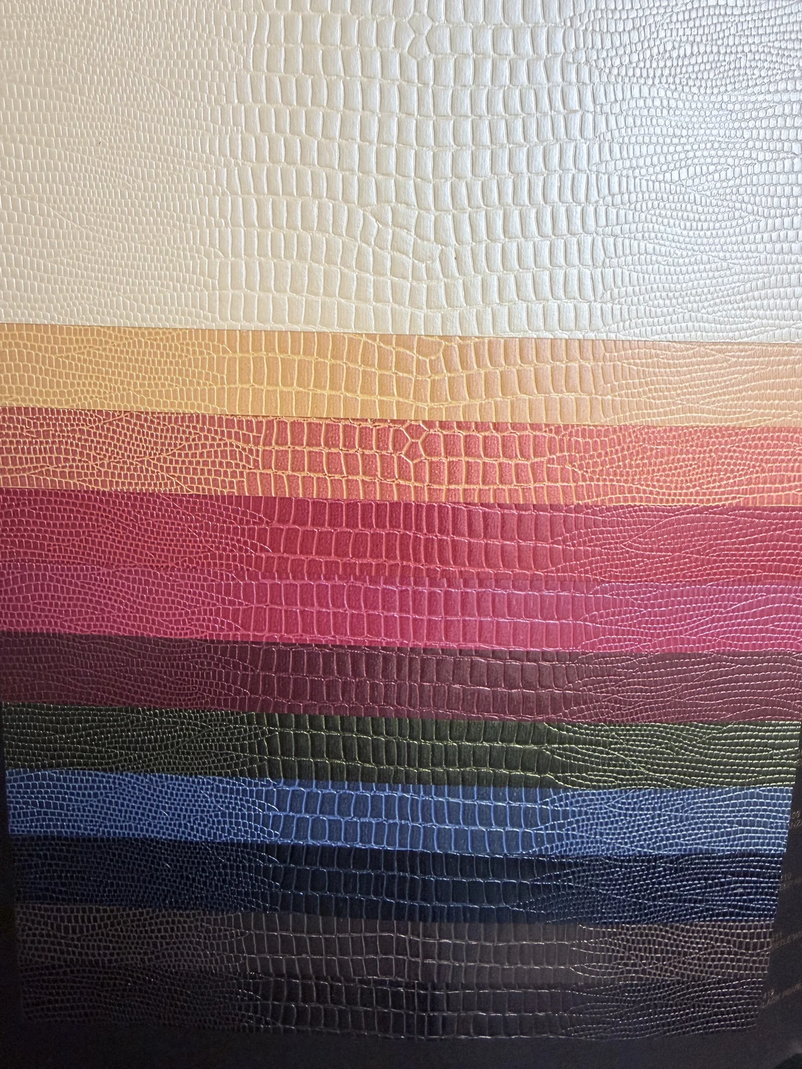
The choice of colours and textures is wide.
There are very quiet surfaces that stay in the background, and there are pronounced leather textures.
Croco, galuchat, lizard and other exotic looking embossings can give a book or an album an entirely different character.
Pellaq offers surfaces with just as much presence, and we work it in exactly the same way as Skivertex.
I never choose on texture alone.
Colour, surface, what the piece will be used for and the finishing all have to work together.
Embossing on Skivertex and Pellaq
For our work it matters a great deal that these materials take embossing well.
Depending on the design we work with hot foil stamping or blind embossing.
The same rule applies here as with any other material:
not every foil transfers equally cleanly onto every surface.
The stronger the texture, the more important the test stamping becomes.
So before the actual production run we check how foil, temperature, pressure and surface behave together.
The embossing should be clear and crisp without distorting the material unnecessarily.
Sometimes we print on it as well
Skivertex and Pellaq do not have to be embossed.
Depending on the design, we also print straight onto the covering material.
That calls for a check beforehand: how the particular surface takes the ink, and whether fine detail comes out cleanly.
A smooth surface behaves differently from a heavily embossed one.
Here too, the design cannot be considered on its own. What matters is how design and material work together.
Small envelopes
I am especially fond of small envelopes made from these covering materials.
They hold their shape better than an ordinary paper envelope and feel quite different in the hand.
Colour and texture allow them to become part of the overall design and to be matched to an invitation or card.
Small commissions like these show me how much a material can contribute to the overall effect.
Not leather, but with a character of their own
Skivertex and Pellaq are not real leather.
And I would not treat them as a simple substitute for it either.
Leather has its own surface, its own feel and its own patina.
The strength of these covering materials lies elsewhere.
They are more consistent, they come in many colours and textures, and they can be chosen and worked with great precision for a particular design.
That is what makes them so interesting for our work.
The material has to suit the design
I like materials with character.
But the same holds true here:
the boldest texture and the loudest colour are not automatically the right choice.
For a quiet notebook, a fine surface can be exactly right.
On an album, a croco, galuchat or lizard texture can make a much stronger statement.
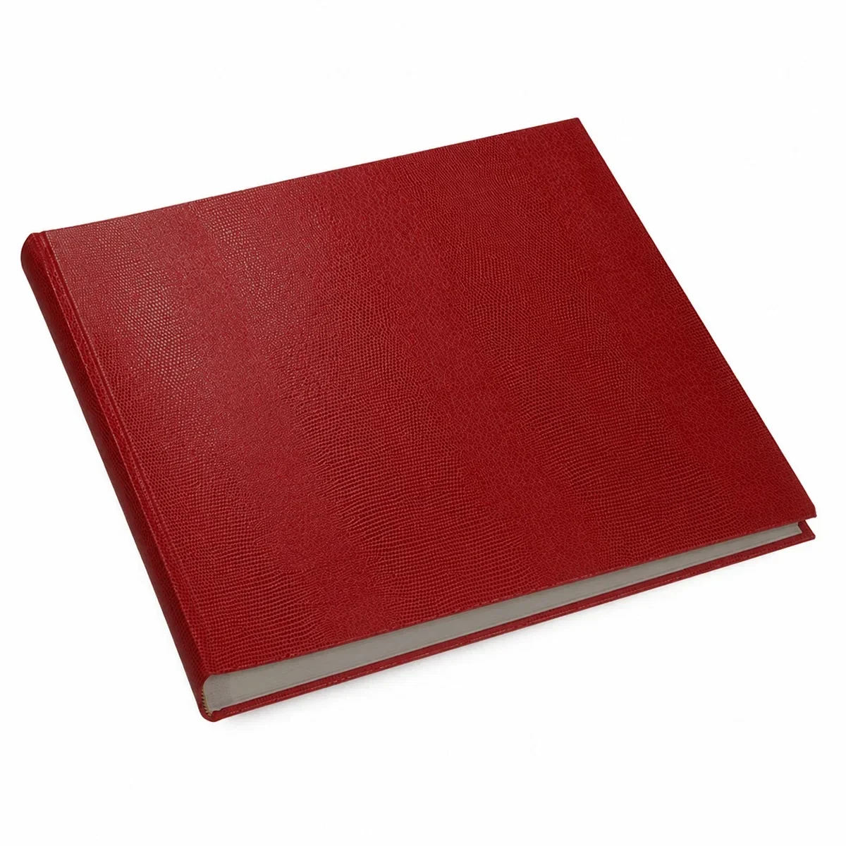
And as soon as embossing or printing comes into it, the surface has to be chosen so that lettering or a motif can show to full effect.
The material should support the design rather than compete with it.